Patrocinado
How to Match Confetti Colors With Your Event Theme
Color cohesion is critical in event design. Confetti isn’t just decoration—it’s visual dynamism. Matching it intentionally to your theme can elevate an event’s aesthetic impact.
A. Analyzing Theme Color Palette
First, identify your event’s core colors: main, secondary, and accent hues. Bring swatches or digital palettes to your confetti supplier. Look for:
-
Saturated solids (consistent hues)
-
Metallic tints (gold, silver, rose gold)
-
Pastel or opaque finishes (delicate aesthetics)
Your supplier may offer customizable blends or pre-mixed combos that reflect your palette.
B. Understanding Mood Through Color Combinations
Colors carry emotional undertones:
-
Soft pastels (mint, blush, lavender) evoke romance, calmness, or whimsy.
-
Bold primaries or neons bring excitement and youthful energy.
-
Metallics (gold, silver, copper) radiate glamour or prestige.
-
Seasonal tones (orange‑berry in autumn, emerald in winter) tie confetti to seasonal symbolism.
Choose colors that complement or contrast visuals like linens, lighting, or floral arrangements for dramatic effect.
C. Blend Style and Shape
Mix color with shape to reinforce brand or theme:
-
Combine heart‑shaped pink and gold foil pieces at weddings.
-
Use leaf‑shaped green and gold paper pieces for fall or eco events.
-
Employ mini‑star shapes or logo cutouts in brand hues for corporate or celebration themes.
Just ensure pieces are sized similarly so heavier elements don’t drop faster, creating uneven visuals.
D. Testing Confetti Samples
Before committing:
-
Request sample packets or swatches.
-
Drop a handful under similar lighting to see how colors interact with ambient or spotlighting.
-
View pieces under warm vs. cool tone lighting; hues may shift or distort.
Lighting influences perception: blues appear deeper under cooler LEDs, reds glow richer under incandescent fixtures.
E. Volume Proportions for Palette Balance
If mixing colors, decide blend ratios:
-
Balanced mixes (e.g., 40 % main hue, 30 % accent, 30 % shimmer) maintain scene cohesion.
-
Accent pops (e.g., 80 % white confetti, 20 % metallic) emphasize sparkle without overwhelming.
-
Gradient releases (e.g., gentle fuse from white to gold) produce dreamy visual arcs.
Calculate quantities needed: vendors often list blend by weight; specify how many blasts or square-feet coverage per minute you expect, to match color demands.
F. Visual Flow and Lighting Sync
Coordinate confetti color with stage or ambient light cues:
-
At reveal moments, warm up lighting slightly before a gold explosion for warmth and brilliance.
-
Use colored spot washes to shift tone during pastel cascades.
-
Bathe the confetti burst zone in matching or complementary light to unify effect.
Assure that crew know what hue blend is loaded and what light state corresponds for maximum synergy.
Read More Here:- https://avsyncstudio.wordpress.com/2025/08/04/best-confetti-machines-compared-which-one-is-right-for-you/
Categorias
Leia mais
In the vibrant world of online gambling, where the thrill of the game meets the allure of the unknown, stories of players uncovering hidden secrets can quickly become the stuff of legend. Such is the tale of a savvy gambler who recently cracked the code and uncovered a hidden mode in Brand's Virtual Casino, a feature that has eluded even the most seasoned players. While the details of this...
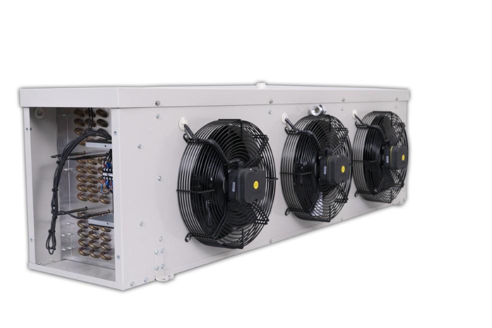
The Asia Pacific Condensing Unit Market is witnessing dynamic growth fueled by rising demand in commercial refrigeration and HVAC sectors across the region. Increasing industrialization and the need for energy-efficient cooling systems are key factors shaping this evolving industry landscape. Recent advancements in eco-friendly refrigerants and stringent regulations are further propelling...