


Sponsorizzato
Why is White Space Crucial in Design Layouts?
Ever walked into a cluttered room and felt instantly overwhelmed? That’s exactly how viewers feel when looking at a crowded design. This is where white space, also known as negative space steps in to save the day. If you're diving into the creative world through one of the best Graphic Design Courses in Chennai, you’ve likely already heard about it. But what exactly is white space, and why does it matter so much?
In this post, we’ll explore how white space in graphic design isn’t just about “empty” areas, it's an essential part of making your visuals more engaging, legible, and effective. Let's break it down.
What Is White Space in Graphic Design?
White space is the area in a design that’s left unmarked, no images, no text, no icons. It doesn’t necessarily have to be white; it just means “empty” or “unused” space. When applied thoughtfully, white space in graphic design enhances readability, creates balance, and draws attention to key elements.
Think of it as the silent partner in every beautiful composition; it gives your content room to breathe and makes your message louder by saying less.
The Psychology Behind White Space
There’s a reason you find peace when you look at a clean, minimalist design. It’s psychological. White space offers visual relief, which makes content easier to process and reduces cognitive overload.
This principle applies whether you're designing a website, a brochure, or something more immersive like Environmental Graphic Design. It guides the eye and helps users digest information without feeling bombarded.
White Space in Design Examples That Prove the Point
Let’s consider some white space in design examples you see every day:
-
Apple’s website: Simple layouts, clean lines, and plenty of space around products make the visuals pop.
-
Magazine spreads: Notice how high-end publications often dedicate half the page to white space to make headlines more dramatic.
-
Luxury branding: Minimal logos and product packaging rely heavily on negative space to communicate elegance and exclusivity.
These examples show how less really is more.
Common Graphic Design Mistakes: Ignoring White Space
One of the Common Graphic Design Mistakes beginners make is cramming too much into a single space. When everything is emphasized, nothing truly stands out.
Design without enough white space can feel noisy, disorganized, and even amateur. Whether you're designing a website interface or a business flyer, resisting the urge to "fill the gaps" will immediately elevate your work.
That’s why any quality UI UX Designer Course in Chennai emphasizes layout spacing as one of the foundational skills for any aspiring designer.
How White Space Helps Focus and Clarity?
Design is communication. When there’s too much going on, the message gets lost.
White space helps your audience focus on what matters. It can:
-
Improve readability and legibility.
-
Guide the user’s eye from one element to the next.
-
Create a sense of elegance and sophistication.
-
Improve overall user experience and retention.
In other words, white space graphic design isn't lazy design, it's smart design.
White Space in Art and Its Legacy in Design
Historically, white space in art has been a subtle but powerful concept. In traditional Asian art, empty spaces are used intentionally to convey mood, silence, or contemplation. These principles carry over into modern design, especially in branding and editorial design.
White space draws from a long legacy of minimalism and clarity, key ingredients in effective graphic communication. If you are pursuing a career in Design, understanding this history adds depth to your practice and portfolio.
Using White Space Strategically in Layouts
So how do you actually apply white space?
-
Around Text: Increase line spacing and margins for better readability.
-
In UI Design: Add padding between buttons, icons, and sections.
-
In Branding: Give logos room to breathe, don’t clutter them with too many elements.
-
In Composition: Utilise grids and alignment to effectively manage space.
These tips are especially crucial if you're designing for the web or mobile. Understanding spacing, balance, and rhythm is one of the skills taught at any Training Institute in Chennai with a strong design curriculum.
How White Space Can Help Your Business
If you're a business owner, you might wonder: How does this affect me?
Well, clean and intentional design isn’t just nice to look at it influences customer behaviour. Effective use of white space can:
-
Enhance brand perception.
-
Boost user engagement.
-
Improve conversion rates.
In short, Graphic Design help your business appear more professional, credible, and user-friendly. Whether you’re selling products, offering services, or building a personal brand, white space is a silent salesman working in your favour.
Designs overloaded with content can overwhelm the viewer, while clean layouts with intentional gaps help the message stand out.
To wrap it up, white space in design isn’t just a background element it’s a tool. It guides users, organizes information, and elevates the aesthetics of any project. Great designers know that mastering space is just as important as mastering color or typography. And whether you're just starting out or looking to refine your skills, remember this: It’s not just what you put into a design it’s also what you leave out that counts.
Categorie
Leggi tutto
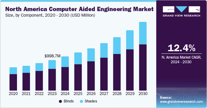
The global computer aided engineering market size is expected to reach USD 23,405.4 million by 2030, registering a CAGR of 12.8% from 2023 to 2030, according to a new report by Grand View Research, Inc. Rapid growth of the wearable industry is likely to increase the use of CAE software in the electronics industry. The major players in the market are in search of new sources of revenue as the...
The Inline Automated Optical Inspection System market research report, as published by Market Insight Reports, provides insights into the current global outlook and key regions, examining Major Players, Countries, Product Types, and end industries. It focuses on top players in the global market and categorizes the market based on several parameters. Noise Inline Automated Optical...